Before I saw Jack’s Abby set out to refresh its branding, I’d never stopped to consider the meaning behind its current logo; I suppose, over these last seven years of the current logo’s existence, I’ve been too distracted by uncountable mugs of frothy lager and innumerable slices of bubbling hot pizza — and pretzels, so many pretzels — for a close reading.
The logo you see attached to the Jack’s Abby name today did not appear until around 2015, emerging about the same time the brewers moved from their taproom on Morton Street in Framingham to the spacious restaurant, beer hall and production brewery on nearby Clinton Street.
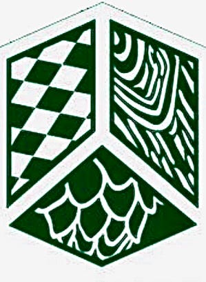
There is a shield — signifying the need to protect the craft of brewing — separated into three parts which represent the founders, the brothers Hendler: Jack, Eric, and Sam.
Within the shield Jack’s placed distinctive patterns. The top consists of the Bavarian flag, representing the German brewing tradition, alongside wood grain, a nod to barrel-aging beer. Below sits a partial hop bud, an integral ingredient in brewing.
Until recently, the three patterns were foundational pieces for the 11-year-old brewery. But sometime between its moving to a new beer hall and brewhouse, partnering with the Boston Celtics, changing wholesalers, and growing into the largest brewery outside Boston, Jack’s has found the patterns within the shield no longer hold as much significance.
The Bavarian flag remains important to the fabric of the brewery. But while hops still make up its beers, by no means does Jack’s consider itself a hop-forward brewery. And even as Jack’s still ages beers in barrels, that portion of its brewing catalogue is mostly reserved to one massive release a year in the form of the “Framinghammer” Baltic porters.
“After a period of time, the things your imagery says to your consumer when you’re not there may not reflect who you are or who you want to be,” Rob Day, Jack’s vice president of marketing, told me. “That realization hit us probably in early 2020.”
“As we looked back at our brand, design-wise, with fresh eyes, it didn’t really say what we were trying to say anymore,” Day added.
Jack’s would have to put any plans for a brand refresh on hold in 2020. The marketing team picked the project up again this February, as the company embarked on a long period of introspection. They teased their work last month, then revealed the first step of the brand refresh yesterday — the new logo.
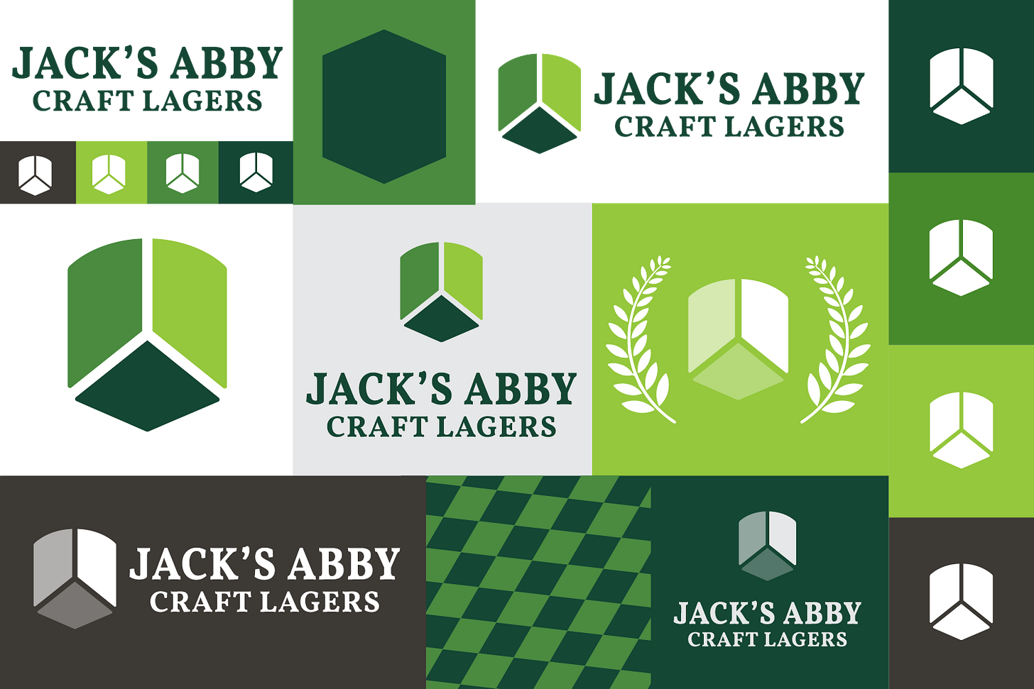
“We thought about what is most important to us in terms of reflecting this community, this process, the beauty through simplicity,” Day said of how the team came up with the pared down logo.
The shield and its three sections remain, but stripped of the patterns inside the crests. The aegis has a rounded top, evoking the giant steel fermentation tanks inside Jack’s brewhouse. It’s painted in three different shades of green, the subtle progression of color symbolizing the process needed to execute a great lager.
The font for the brewery’s name has changed, too. It’s modern, clean, but with hints of the whimsical text used when the brewery debuted in 2011.

Now Jack’s turns to arguably the most critical and time-consuming portion of its brand refresh: the redesign of its cans and packaging. Day told me we should expect that reveal on Jan. 6.
“Basically every can packaged from Jan. 1 on will be in new cans,” he said. “No cans are leaving our place after January with old packaging.”
Come March and April, the Jack’s you see on the shelf at liquor stores will bear fresh branding. Sure, the cans and cases will look different, but nothing will have changed with the beer inside.
Redemption Rock finally gets into the hard seltzer game
If you aren’t in the mood for beer or any coffees or teas during your next trip to Worcester’s Redemption Rock Brewing Co., you now have another option: hard seltzer.
The Certified B Corporation brewery and café made its first line of hard seltzers, “Fizzle Fiends,” in raspberry-lime, a flavor that pays homage to another popular Worcester seltzer-maker. Redemption Rock expects to roll out more Fizzy Fiends flavors soon.
Fizzle Fiends is a collaboration between Redemption Rock and the Worcester-based podcast SeltzerTime, in which hosts Ricky Nelson and Travis Duda spotlight and champion local businesses, artists, musicians, nonprofits, community advocates, among others.
“As soon as we decided to make a hard seltzer, we knew we had to get SeltzerTime involved,” Dan Carlson, head of marketing at Redemption Rock, said in a press release. “They’re not only Worcester’s preeminent seltzer experts, they’ve been big supporters of ours and so many great things in the city for a long time. And of course, seltzer should be enjoyed with your friends.”
Duda and Nelson are stewards of well-crafted seltzers, whether with or without alcohol. “We feel like more seltzers the merrier. We are simply stoked about any seltzer available and super stoked that our buds at Redemption Rock have gotten into the bubbly game,” Duda said in an email.

Fizzle Fiends is a name created by Duda to describe fans of the podcast. As far as their input on the making of the hard seltzer, Duda and Nelson entrusted Redemption Rock to do their beloved bubbly refreshment justice.
“We trusted them to dial it in flavor-wise, which they nailed. It doesn’t have that weird after taste you find in most hard seltzers,” Duda said.
SeltzerTime’s top 5 Polar flavors:
Raspberry lime
Cranberry lime
Lime
Classic seltzer
Lemon
Leave a comment with your top five.


Cranberry lime (classic and the best), raspberry lime, pink lady apple & lemon, Dragon Whispers, lime